Bathroom design trends constantly change.
But neutral bathroom tile colors continue to dominate high-end bathrooms year after year.
Why?
Because neutral tones create:
- calm spaces
- timeless design
- better lighting balance
- more flexibility with decor
This is why luxury bathrooms rarely use extremely bold colors as the main surface.
Instead, they rely on:
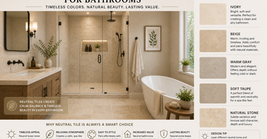
- ivory
- beige
- warm gray
- soft taupe
- natural stone variation
This guide explains the best neutral tile colors for bathrooms and how to choose the right tone before you buy.
Explore neutral natural stone collections here:
https://mosaicbros.com/collections/travertine-tiles
Luxury accent mosaics:
https://mosaicbros.com/collections/marble-mosaic-tiles
Why Neutral Tile Colors Work So Well
Neutral bathroom tile creates:
- visual calm
- softer contrast
- timeless appearance
- cleaner design flow
Unlike trendy colors that may feel dated quickly, neutral palettes adapt easily over time.
This makes them ideal for:
- modern bathrooms
- spa-inspired spaces
- luxury interiors
- smaller bathrooms
Ivory Tile: The Most Timeless Bathroom Color
Ivory is one of the safest and most versatile bathroom tile colors.
Why designers love it:
- brightens the room
- reflects natural light softly
- works with warm and cool accents
Ivory travertine especially creates:
- soft movement
- natural warmth
- elegant texture
Popular ivory travertine option:
https://mosaicbros.com/products/ivory-travertine-12x24-honed
Beige Tile: Warm and High-End
Beige creates a warmer and more grounded look than pure white.
This is why many luxury bathrooms use beige natural stone instead of stark white surfaces.
Beige tones create:
- comfort
- warmth
- architectural softness
They work especially well with:
- wood vanities
- brass fixtures
- warm lighting
Explore warm neutral travertine styles:
https://mosaicbros.com/collections/travertine-tiles
Warm Gray Tile: Modern Without Feeling Cold
Warm gray has become one of the most popular modern bathroom colors.
The key word:
warm.
Cool gray bathrooms can sometimes feel sterile or flat.
Warm gray creates:
- cleaner modern appearance
- softness
- better depth
This works especially well in:
- minimalist bathrooms
- large-format tile layouts
- contemporary interiors
Example modern option:
https://mosaicbros.com/products/silver-travertine-12x24
Soft Taupe and Greige: The Luxury Designer Palette
Luxury bathrooms increasingly use:
- taupe
- greige
- soft earth tones
instead of pure white.
Why?
Because these tones:
- layer beautifully
- photograph better
- feel more natural
- create richer depth
This creates the calm “spa bathroom” look many homeowners want.
Natural Stone Variation Makes Neutral Bathrooms Feel Expensive
One mistake many bathrooms make:
- flat solid colors everywhere.
Luxury bathrooms often include subtle variation through:
- travertine
- marble veining
- natural stone movement
This creates texture without overwhelming the room.
Luxury mosaic accents:
https://mosaicbros.com/products/thassos-marble-herringbone-mosaic
Which Neutral Colors Make Bathrooms Look Bigger?
Lighter neutrals typically create:
- brighter appearance
- more reflection
- open visual flow
Best options:
- ivory
- light beige
- warm cream
- soft warm gray
These tones work especially well in:
- small bathrooms
- bathrooms with limited natural light
Which Neutral Colors Look Most Expensive?
The most luxurious bathrooms usually avoid:
- extreme bright white
- harsh contrast
- overly trendy colors
Instead they rely on:
- layered neutrals
- warm natural stone
- matte finishes
- subtle texture variation
This creates depth and sophistication.
Matching Neutral Tile with Bathroom Style
Modern Bathroom
→ warm gray + large format tile
Classic Bathroom
→ ivory travertine + soft beige
Luxury Spa Bathroom
→ layered warm neutrals + natural stone
Mediterranean Style
→ beige travertine + textured mosaics
Common Neutral Color Mistakes
1. Choosing Colors That Are Too Cool
Very cold tones can feel sterile.
2. Using Pure White Everywhere
This often removes warmth and depth.
3. Ignoring Lighting
Bathroom lighting changes how neutral colors appear.
4. Mixing Too Many Undertones
Warm and cool neutrals should be balanced carefully.
The Professional Formula
If you want a bathroom that feels timeless:
Use:
- layered warm neutrals
- natural stone textures
- large-format tile
- subtle variation
Avoid:
- harsh contrast
- overly trendy colors
- excessive glossy surfaces
Why Travertine Continues to Dominate Neutral Bathroom Design
Travertine naturally contains:
- ivory tones
- beige warmth
- soft movement
- layered variation
This makes it one of the easiest materials to design around.
It works beautifully in:
- modern bathrooms
- classic interiors
- luxury spa spaces
- timeless home designs
Explore the full collection here:
https://mosaicbros.com/collections/travertine-tiles
Final Thought
Neutral bathroom tile is not boring.
When done correctly, it creates:
- warmth
- elegance
- softness
- timeless luxury
The key is choosing neutrals with:
- texture
- depth
- natural movement
That’s what separates an average bathroom from a truly high-end one.
)